Is your website responsive?
How does your website look on different devices? Are you using a separate mobile site for your mobile users? Did you know that website usability has a large impact on your SEO?If you don’t know what experience your viewers are having, you should investigate. You might want to learn about “responsive design,” the latest site development tool to provide an optimal viewing experience—easy reading and navigation with a minimum of resizing, panning, and scrolling—across a wide range of devices, from desktop monitors to mobile phones.
Think about how people experience your website.
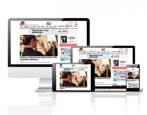
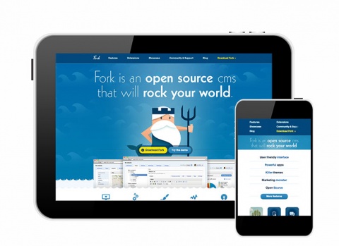
Your website should give the visitor a satisfying experience no matter what kind of device they use—desktop, laptop, tablet, mobile phone, or television. Their experience with your site heavily relies on their device’s screen size, resolution and available network bandwidth, which impacts page responsiveness. Your content should be optimized for every device so users can find the information needed quickly and easily.
Consider the buttons and navigation on your website.
On a mobile device, does your site’s navigation work well on a small screen? The space should be optimized for the user to find the desired content. Users on mobile devices use their finger to move and scroll through your website. If your site is not responsive, the buttons may not be user friendly on a smaller screen. Sites that utilize hover-over functionality will be difficult for mobile users to navigate unless other functionality has been added. With responsive design, the buttons can change based on your screen size and device so they will be optimized for navigation.
Stick to a single website if possible.
You could build multiple mobile sites and apps for your users to accommodate all of their devices. We recommend instead that you streamline through a single website built with responsive design. In addition, your SEO results will come from a single site instead of multiple platforms. This makes it easier to target leads and increase your website traffic. Users will find it more convenient to access one site from any device to find whatever they need.
If you haven’t thought about your website usability, consider these questions.
- Are your sales teams using your site to sell?
- Does it give users information quickly and easily?
- Is it simple to navigate on your mobile phone?
Building your website in responsive design delivers the best experience to all your users regardless of their device.