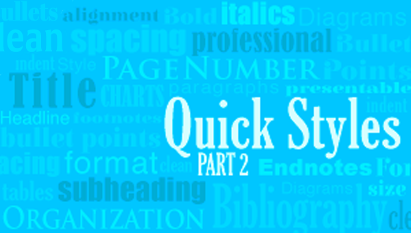
Part 1: Why you need to use Quick Styles in Microsoft Word
For those of us who work in Microsoft Word* on a regular basis, we know Calibri. Why? Because it is the font of the default style that every new document in Word opens to (unless you’ve set a new default). Wait—there’s a default style? Yep. And since you are still reading this, I’m guessing you haven’t used quick styles or created your own style set yet.
Now, the Calibri font works—for quickly writing and beginning documents. But Word has many more fonts, formatting options, and styles that you should take advantage of to deliver documents that look more professional and presentable. Your documents need to be well-organized and have a consistent look to reflect your expertise. (Plus, you can show off your snazzy Word skills.)
There are many reasons for using styles in Word. Formatting text, or automatically formatting by applying styles, helps readers quickly understand a document visually. Adding formatted headings allows readers to sort through text and focus on the most important content. Proper formatting can also make long documents appear shorter, with smaller footnotes and larger headings to break up large blocks of text. Numbered lists and bullets also help readers assimilate ordered information easily.
Using styles will also save you time. Without styles, you are probably formatting your documents manually. For each chunk of text, you have to select the font type, size, paragraph alignment, color, bold, italics, etc. This can be very time-consuming and tedious to go through all these steps for each section of your document. With styles, though, the repetition is no longer necessary because all these details are predefined.
Meet the “styles”
You can customize every document to the nth degree, but chances are you don’t want to spend that much time on every document. This is where the styles in Word become your best friend.
Here’s a basic overview. Microsoft has built-in styles that provide formatting for the different levels of text in your document. There can be many styles in a document, but the basics are title, subtitle, headings, body (Normal), emphasis, quote, and list paragraph. You can apply styles while you are working on or after you complete a document.
Choose your style set
The default style set is Word 2010 and comes with 18 styles, or text levels. When you open Word, the new blank document will be in this template. Word automatically suggests the formatting for text levels with this default style set. These can be applied and modified as you like.
Let’s walk through how these work.
- Open a simple document that has lots of text.
- Use your cursor to highlight some text that we will apply a style to. For example, highlight the title or a section heading of your document. (By the way, for most styles, you don’t need to select all the text but rather click somewhere within the paragraph to which you’d like to apply a style.)
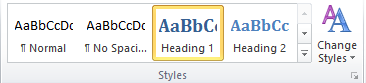
- From the Quick Styles Gallery in the ribbon, select “Heading 1.”
You will see the text you highlighted changes to match that style. You can use these styles to create different formatting throughout the document.
Change the style set
This is where the true power of styles is shown. Once you have assigned a style to all the text in your document using the steps above, you can change the style set, which will reformat your entire document in one click. Use the “Change Styles” dropdown button in the ribbon. Go to “Style Set” and place your cursor over one of the options.
Here is where you will love Word’s wonderful previewing capabilities! You don’t need to click on a style set to see what it will do to your document. Scroll your mouse through the options to see how the style set will affect your document. Try different ones until you find one that works for your document.
Note: The Style Set you select will determine what options you have in the Quick Style Gallery.
After you pick a style set, you can modify the formatting in the current document, and it will not affect the saved style unless you manually update it, which is not necessary unless you want to preserve the settings.
If you do want to preserve these settings so you can use the same style again, you’ll need to save the style set. Learn how to do this in our next post! Stay tuned for Part 2: How to create your own Quick Style in Microsoft Word.
*These instructions are for the PC version of Microsoft Word 2010.