Web Design Wizardry: Graphic Design Trends
Welcome to this installment of our Graphic Design Trends series.
This time we are focusing on current trends in Web Design. According to the Pew Research Center, 91% of American adults have a cell phone, 55% of American adults have a smartphone, and 42% of American adults own a tablet computer. This growth in personal mobile technology has influenced web design, and many of the current trends focus on designing for mobile devices, including smartphones, tablets, and even netbooks.
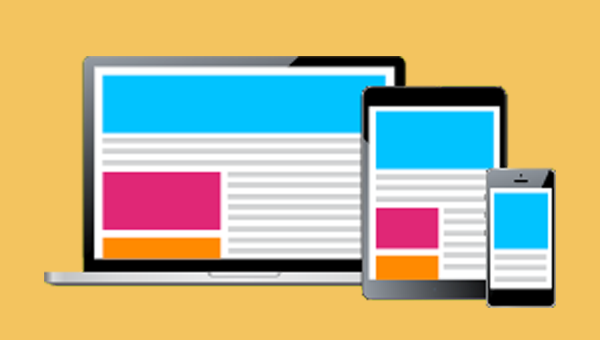
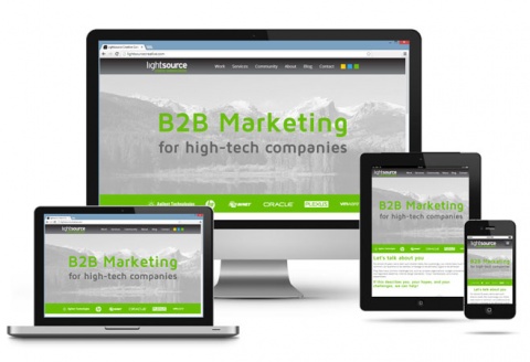
Responsive design
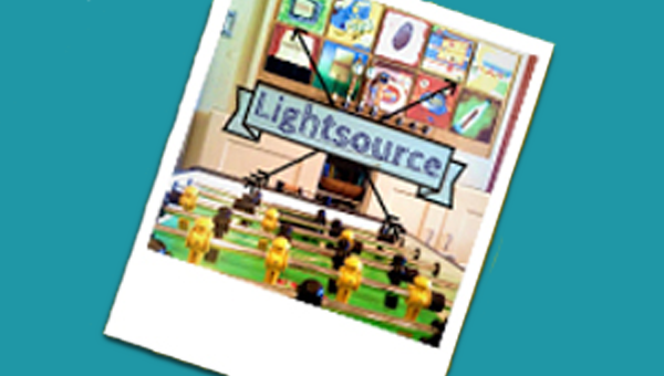
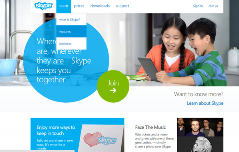
Responsive web designs respond and change based on the user’s screen size. This is controlled by the back-end coding of the website and happens automatically, affecting things such as font sizes, menus, images, and layout. The major benefit of this type of design is that the data is all pulled from one place, eliminating the need to have separate sites for desktops and mobile devices. The Lightsource website that you are reading right now uses responsive design. You can see it in action if you are on a desktop computer. Shrink the size of your browser window, and you will see the website respond to the new size. Read an earlier blog post to learn more about the benefits of a responsive web design.
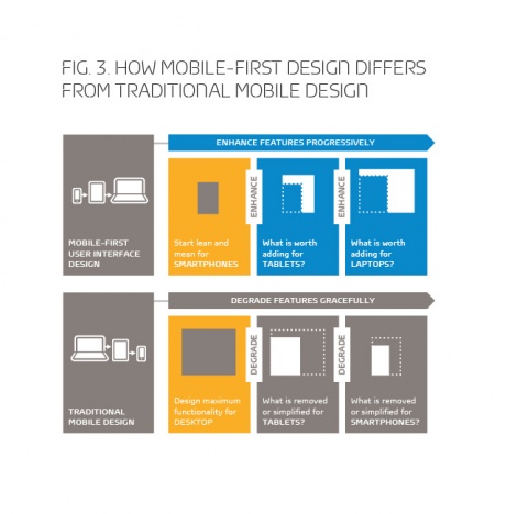
Mobile-first design
Mobile-first design is closely related to responsive design. The difference is in the way you approach the design. Instead of starting with a desktop experience and working your way down to mobile, removing (gracefully degrading) elements that won’t work, you begin by designing the best mobile experience possible and then you progressively enhance your designs up to a desktop. With smartphone and tablet sales on the rise and sales of personal computers declining, this trend may become the norm for the future of web design.
Mobile-first design also keeps down resource-hogging plugins like Flash, unnecessary resource and bandwidth intensive “widgets” (looking at you, Facebook), and helps push designs toward ease-of-use and speed—which Google is now taking very seriously in site ranking. Keep it simple!
One-page designs and parallax scrolling
Gone are the days when all content needed to be “above the fold.” One-page designs, or long-scroll designs, work especially well for tablets and mobile devices, but they also work quite nicely on desktops. This type of design puts all of the important information into vertical panels on a page, and the user scrolls downward to view them. This format is excellent for infographics and storytelling, and it requires less clicking and navigation, which is why it works so well for mobile devices.
Parallax scrolling utilizes layers and javascript, along with the scrolling functionality to create animation effects as the user moves down the page. You can see examples of this effect below. This does not work well on mobile devices as the change in screen size can affect how the animations display.

Get to the point with bold graphics and typography
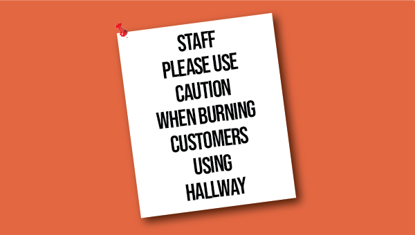
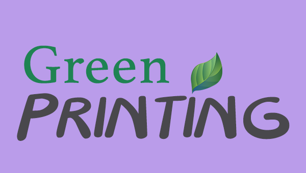
These days you need to capture users’ attention right away and get straight to your point. This is often being accomplished through the use of bold graphics and typography. Whether it is an eye-catching photograph, an interesting illustration, or a bold headline, using large graphics and text elements in your designs will help draw the user’s attention and bring them to your content.
Almost flat design
In a reaction to the skeuomorphism trend that has been prevalent in interface design since the 80s, designers are now opting for a very simple, flat look. While initially the trend was toward a fully “flat design,” some elements such as light drop shadows and gradients have found their way back. These bring depth to the design, but careful consideration of where and when to use them is important, and the emphasis on minimal use is still preferred. The Windows 8 colorful gridded home screen panels and the new IOS7 are good examples of how this aesthetic is being used well. Is this a fad or will it be a longer trend? We’ll have to find out.
Check out our “Design Trends” Pinterest boards for more examples.
Sources:
http://www.gfk.com/magazine/talk/talk-what-is-the-big-next-future-proofed-product-innovation/move-over-mobile-why-successful-apps-start-with-the-consumer-not-the-device
http://www.awwwards.com/20-best-websites-with-parallax-scrolling-of-2013.html
http://designwebkit.com/inspiration/60-typography-driven-websites/
http://www.skype.com/en/